Case Studies
Breathing aid warmer
Heating device for Atos Medical
Concept development
Industrial design
User research
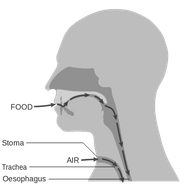
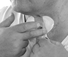
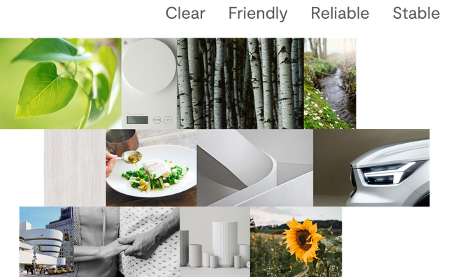
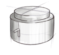
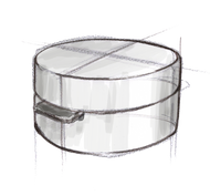
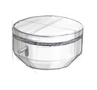
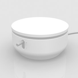
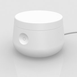
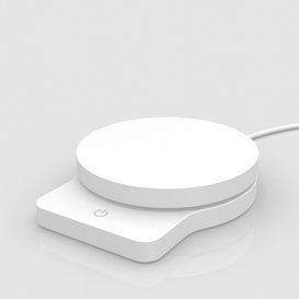
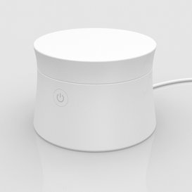
A medical accessory intended for everyday home use by patients that require the aid of a tracheostomy tube that enters their windpipe.
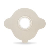
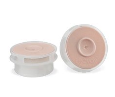
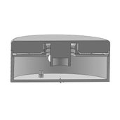
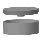
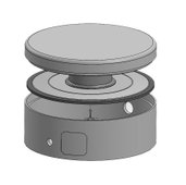
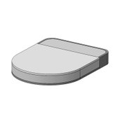
The product is a heating unit for the adhesive adaptor that is placed on the patient’s skin and holds the tube firmly in place. Applying the adaptor at the right temperature is important for the effectiveness of the adhesive layer and for optimal comfort to the patient.
Context and Functionality
To fully understand the brief, I gathered as much information as possible on this medical device and the everyday context of its use. I learnt about Atos's range and the positive impact their products have on patients around the world.
As a designer I think it's both important and most interesting to dive into new areas of knowledge, emmerse one's self in unfamiliar subjects to provide the best design solutions.
User journey and interface
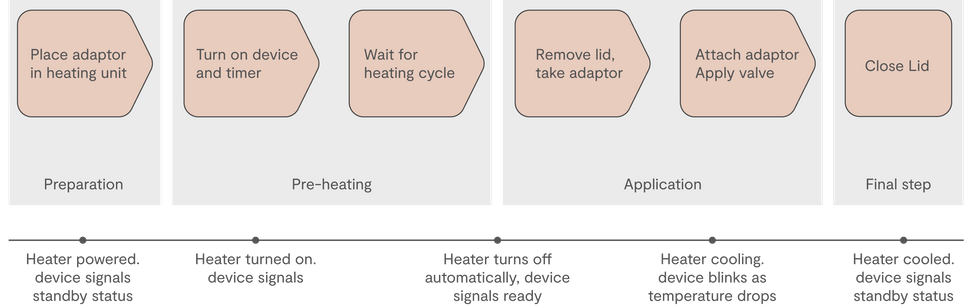
In consultation with the client, the functionality of the product was converted to a flow chart diagram to better visualize and simplify the user experience.
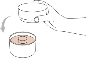
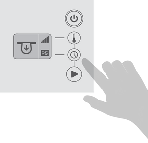
Operating this product involves turning it on with the round adhesive adaptor placed in position. The ON button initiates the pre-heating phase. Once the heating element reaches the desired temperature there is a light indication to remove the lid and the warmed adhesive adaptor. A new blinking indication informs the user that the heater is now cooling down until it reaches a safe temperature again and thus returning to standby mode.
The challenge in this project was to translate this operating sequence to a clear form that will be both easy to understand by elderly patients and visually compatible with home environments of different users.
I'm not as strong or steady as I used to be, so I'd like my heater to be light in weight yet very stable when I use it.
It's important this device is durable and made in good quality, I want it to work every time. I've had other appliances that didn't last very long...
I want my heater to fit in with my home environment so I don't have to hide it between uses, It should be compact and neat, not look like a bulky medical instrument.

Target group and User research
It was very helpful to talk with future users of this device and hear their needs and concerns. As the target group here is made up of mostly disabled and elderly persons it was important to get their unique perspective and priorities. Apart from functional comments I learnt that many users did care about the looks and preferred a consumer-oriented form that would not look as a medical aid but rather as a smart everyday appliance.
Technical specifications
As part of the information gathering phase, I received 3D material and technical drawings from the heating element engineers in order to base the form development on. The production methods were discussed and weighed.
I find it's beneficial to the process to have an early and open dialogue with the technical R&D department, this leads to saving precious time and to better decision-making at the crucial first stages, decisions that impact the progression of the process.
Research and Analysis
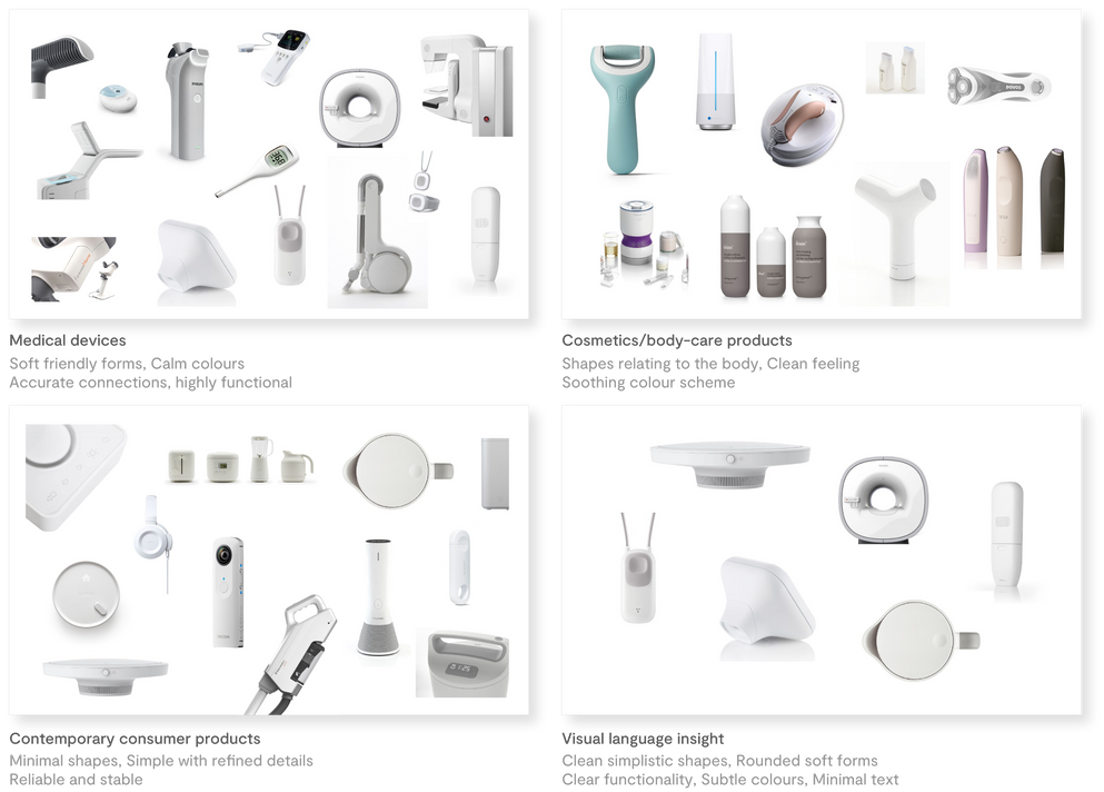
I like to conduct thorough research into the visual language of the product area I'm working on and also look at relevant adjacent product areas. Through this visual exploration I pick up on the physical markers that embody the key values I have identified and defined as crucial elements of the visual appearance.
With this medical device I focused on features that express dependable functionality, stability, quality,
calmness and simplicity.
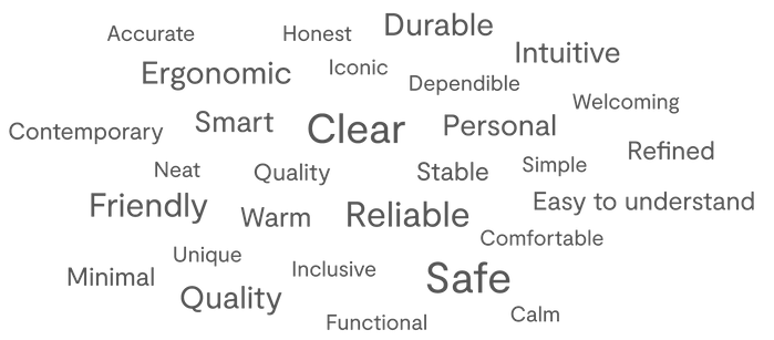
Core values
A vital part of my process is verbalizing my thoughts and conclusions from the brief and all the research material. Some of these words are derived from a branding questionnaire that I give clients to understand what's important to them and how they want to communicate and be perceived.
This method of working with core values and categorizing them is essential to keeping the focus and expression correct during the development process, even when technical or financial challenges present themselves.
Moodboard
To further capture the right expression and aim for the desired user response I create a moodboard that symbolizes on an emotional level the core values of the design.
The moodboard is a good tool to refer to during the development process to ensure details have not drawn the visual appearance away from the intended vision. Also, the moodboard points in the right direction and helps to find correct colours and materials that enhance the product's form.
Form exploration
I tested various solutions for the usability of this product and how it effects the shape. I enjoy the process of exploration to find the best solution when form, function and production issues meet.
I had to consider the existing product range and visual language of the brand as well as complying with the demanding requirements of safety and durability in this field.

3D development
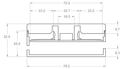
I developed a number of sketches to 3D models in the Rhino program in order to test the aesthetics, proportions functionality and technical compatibility. I looked at different ways the plastic injection production method could be applied.
From these models I could extract 1:1 view drawings to better understand and refine the ergonomic features of the design like grip and button sizes.
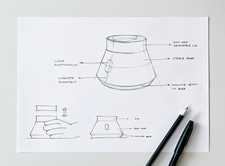
Focus and details
The form I continued to develop combined the required functional features and desired visual appearance.
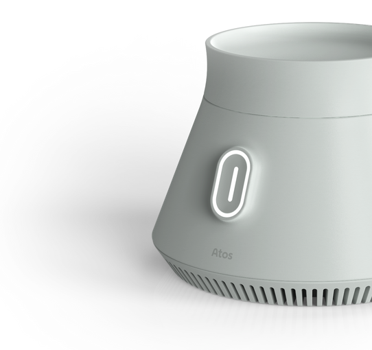
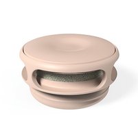
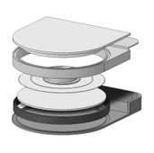
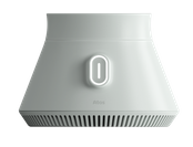
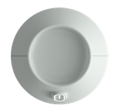
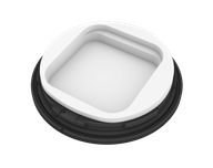
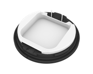
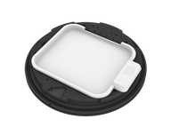
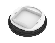
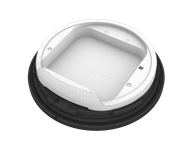
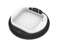
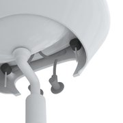
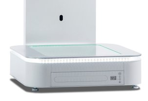
The lid protects the user and the internal mechanism, it is easily griped and removed when needed. the Body of the heater tapers out to provide stability. This form is complemented by a round silicone mat attached to the underside of the base. the product includes a single button that lights up in various ways to indicate the heat status of the device. Air vents were added to the base for swifter cooling.
The general form steers away from a clinical look and refers back to the core values of the project - Simplicity, Calmness, Dependability and Stability.
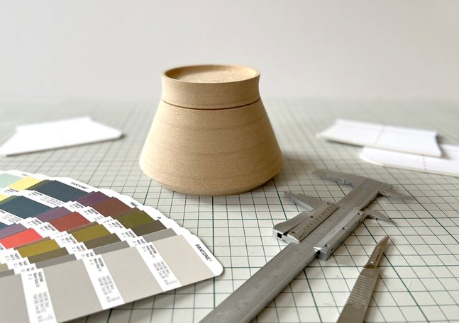
Prototyping and refinement
The form was refined and tested with the help of prototypes in wood and FDM rapid printing.
I enjoy working in the workshop and converting the computer models to physical objects - This phase always forces detail decisions and greatly advances the project forward.

To achieve a home interior look and provide several personal options for the users, a few subtle CMF options were suggested.
The injected ABS parts' finish is matt in order to improve grip and express high quality.
The project required balancing many functional and construction considerations, that had to be understood in detail and combined in the optimal way.
Through dialogue with all the stakeholders in the project the aim was to offer straight-forward simplicity to the user with a high level of engineering hidden from view.
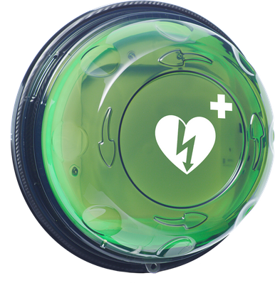
Rotaid 24/7
Smart defibrillator cabinet
Industrial design
CAD modelling
CMF
An innovative heart defibrillator casing that sends real time data to a control centre thanks to its integrated mobile connectivity. Its operational status is continuously monitored so that emergency services can be alerted when the casing is opened, saving critical response time.
The product is designed for the outdoors.
An on-board alarm system, built-in heating and sturdy construction ensure long term durability in the public environment.
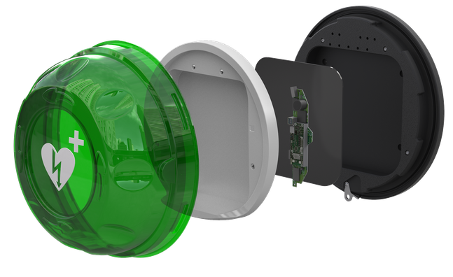
The design went through many iterations as information and new specifications became apparent. The design process of the plastic shell consisted of extensive accurate 3D modelling and continuous collaboration with plastics, thermal and electronic hardware engineers.
Several prototypes were 3D printed to test usability and compatibility to the wall mount.
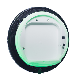
The heart-starting defibrillator is placed on the shelf of the ABS shell and illuminated through the material by a system of LEDs.
Estetic
Porcelain series for Gustavsberg
Concept development
Industrial design
Production material
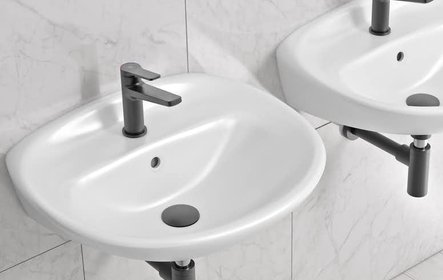
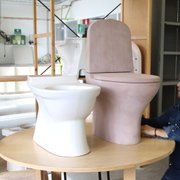
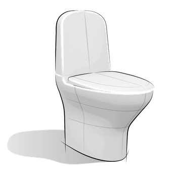
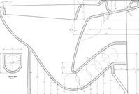
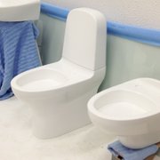
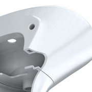
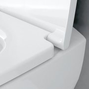
A premium porcelain series, developed over a long period of time, that incorporates the latest production methods with advanced internal mechanisms. The development process combined the accumulated knowledge of Gustavsberg in Sweden with the engineering and production capabilities of the German parent company Villeroy and Boch.
The minimalistic natural look was inspired by the clean organic forms of renowned Gustavsberg designer
Stig Lindberg.
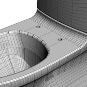
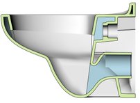
The project was highly technical and called for exact input from many fields of expertise.
Due to the large mold investments and projected longevity of the products every step of the design process was carefully weighed and considered.
At different phases full scale prototypes were produced and functionality thorough tests were carried out.
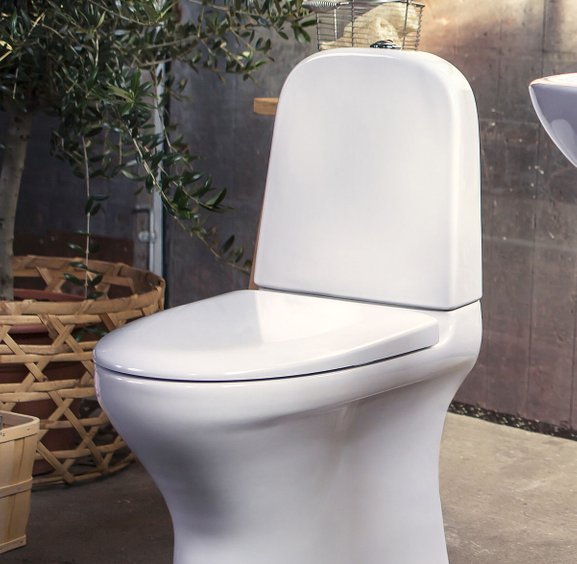
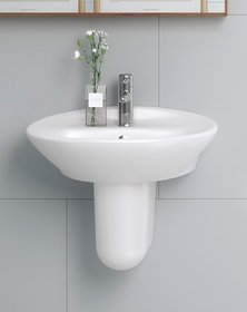
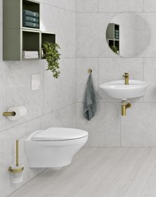
The series includes a floor mounted toilet, a wall mounted toilet, sinks and a bidé. I also worked on various sink taps and shower mixers to complement this series.


It was interesting to explore the meeting between technical requirements and a reserved expression language that fits different environments in the international marketplace. The forms had to be simple and elegant yet function well in leading water.

FitPro
Orthopedic insole former
Industrial design
UI design
User research
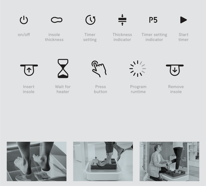
In this project I worked with the user interface and graphic language of the device. It was a challenge to translate the complicated sequence of operations to a clear visual display of only icons so that it could be understood internationally.
Packs
Trekking and everyday sewn gear
Industrial design
User research
Prototyping
I discovered heavy duty sewing machines during my military service, we used these machines in my unit to create specialized gear for our equipement.
Planning, customizing and making my own backpacks and other textile items was one of the reasons I was drawn to studying Industrial design.
Gaining knowledge of materials and textile product manufacturing techniques has prooven useful in design projects in this area.
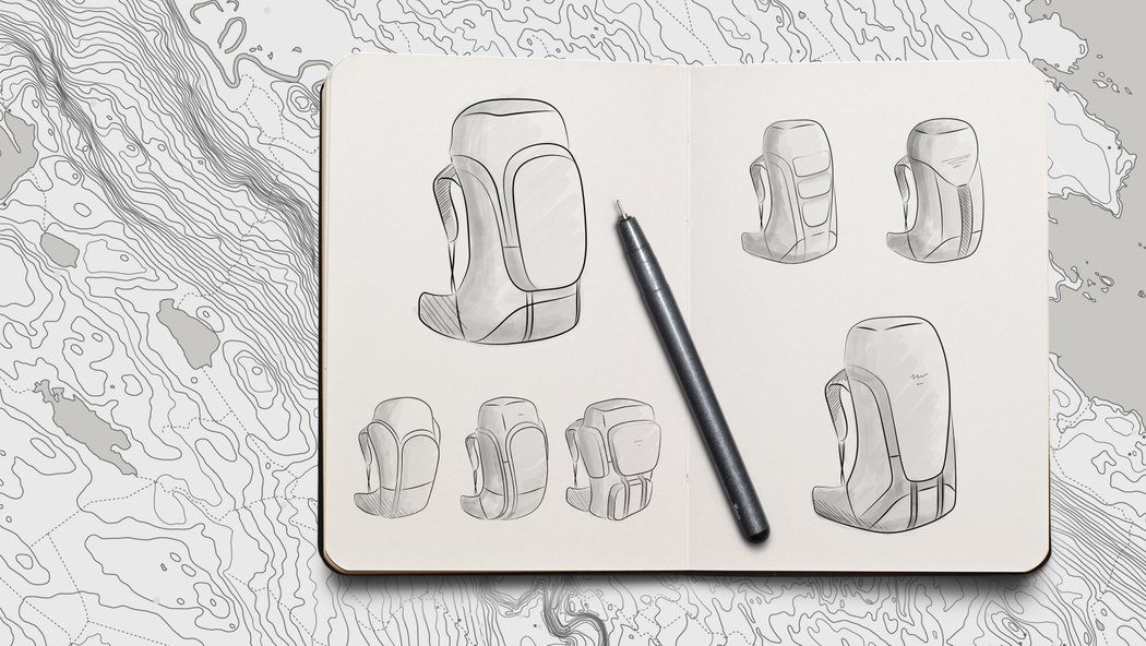
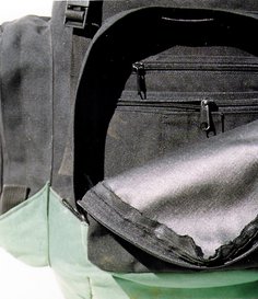
When working on a new project I like to explore different form solutions, corresponding to the various functionality needs. Main considerations include the primary user profile, required durability, total volume, modularity, quick access pouches, water protection, comfort and styling.
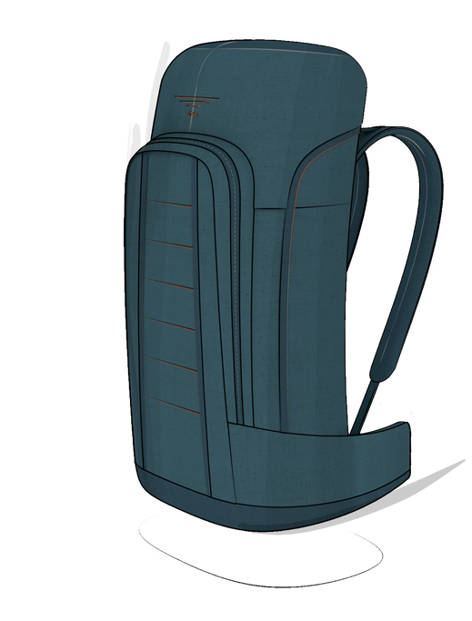
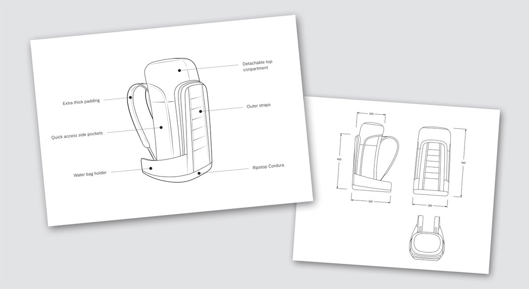
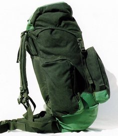
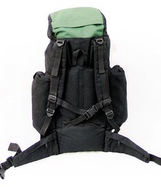
A slim 50 litre mid-size backpack.
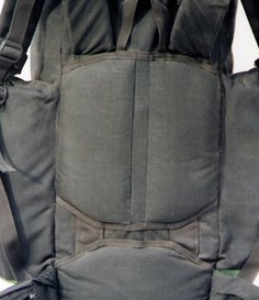
Emphasis was put on durability, comfortable access to the main compartment and side pockets and an overall neat construction that doesn’t snag on vegetation.
At 2.2kg the backpack is light in weight, as unnecessary straps and pockets have been removed. The Bag is constructed of the essential elements needed for day hiking and is made of tough materials that can withstand the natural elements. For example, the fabric on the under side that is especially prone to wear and tear is planned in Cordura 1000.
Outer back straps are provided for the attachment of hiking gear and clothing but in a way that aligns with the shape of the bag and does not create dangling loose ends.
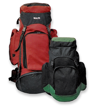
The larger 90L Backpack was my faithful companion on my travels to South America and the Far East. The different compartments and straps were useful in holding all my trekking gear and keep important belongings safe and dry.
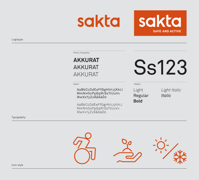
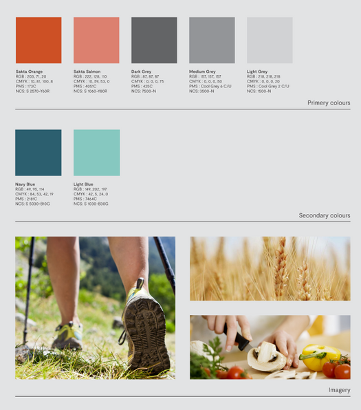
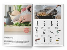
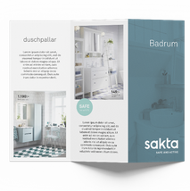
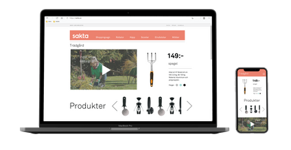
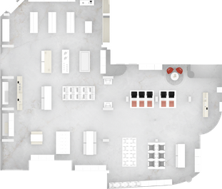
Sakta
Brand identity and store design
Analysis and Branding
User research
Graphic design
Retail space design
A fruitful collaboration with the largest Nordic supplier of everyday solutions for the disabled and elderly.
The project consisted of a wide study of the target group in order to find a visual language that conveys energetic mobility together with safety and reliablity.
The results of the study lead to the development of new brand identity that was implemented in the logo, signage, catalogues, online material and mainly in the interior design of the chain stores.
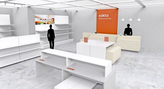
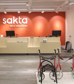
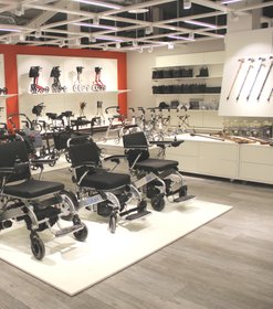
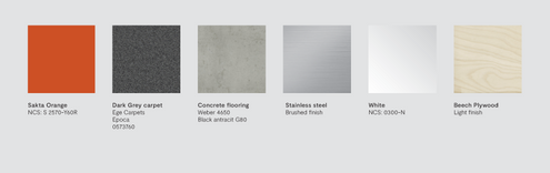
I worked alongside constructors to set up two store interiors complete with an original storage and display system.
The detailed 3D modeling of the projects was beneficial in the communication with the client and craftsmen.
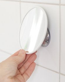
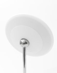
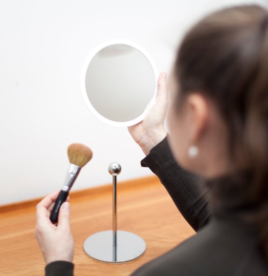
AirMirrors
Magnetic Magnifying Mirror Series
Industrial design
Packaging Design
CMF
A series of innovative magnifying mirrors.
The patented magnetic solution enables detaching the mirror from the wall mount or table stand and use anywhere in the home or on the go.
When placed on the curved metal mount the mirror can be swivelled to the desired angle for optimal distance and lighting.
An additional feature is the wide silicone rim that makes it easy to adjust the position of the mirror without getting fingerprints on the mirror surface and protects the mirror if dropped.
The stainless steel chrome plated details connect to the bathroom environment and ensure the longevity of the product.
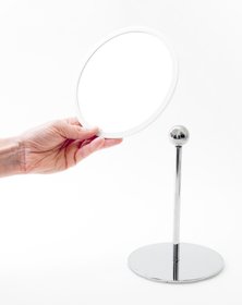
It was a lengthy process with many prototypes to develop the unique magnetic mechanism that keeps the mirror free to move smoothly and detach effortlessly yet firmly stay at the desired angle on the mount.
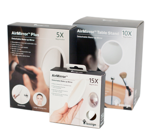

I created the packaging concept for this series including graphics, photography, outer box and the durable inner structure.
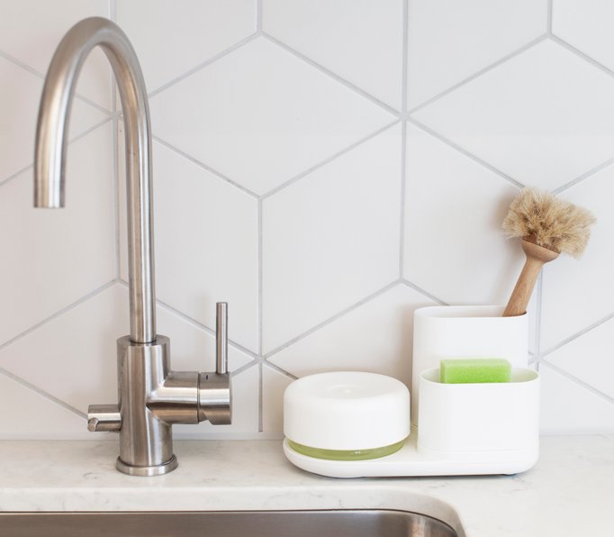
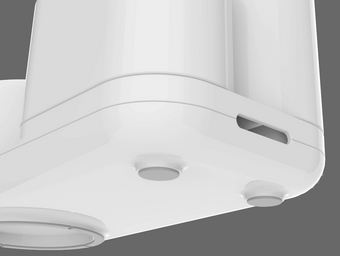
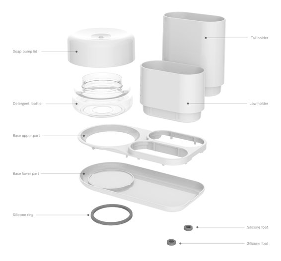
DoDish Caddy
Sink station
Industrial design
Packaging Design
CMF

An award winning product for the home or office environment. The sink organizer provides neat storage for washing-up equipment as well as a patented liquid soap dispenser that minimizes waste.
I designed the packaging of this product as well.
It has been exhibited internationally in various fair booths I have designed for Bosign.
The product was a commercial success and was given numerous awards including the Red Dot in 2017.
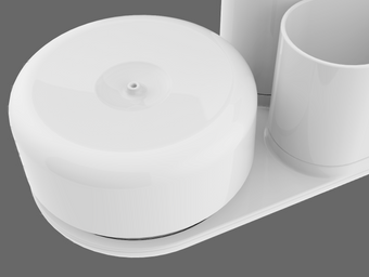
The patented soap pump, produced in blow moulded PET and a PP injected lid. By lightly pressing the lid with a sponge or brush the dish washing liquid is dispensed into the recessed area minimizing waste and mess.
The under side is fitted with silicone feet that support the tray on wet kitchen surfaces. The hole on the side of the product enables emptying any excess liquid into the sink.
The injected parts are pressed into place with just the right tolerance. The structural ribs support the cup parts and keep them fastened to the tray.
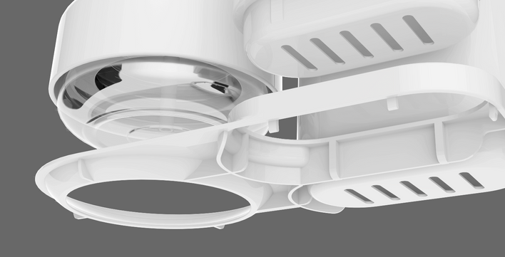
Exploded view
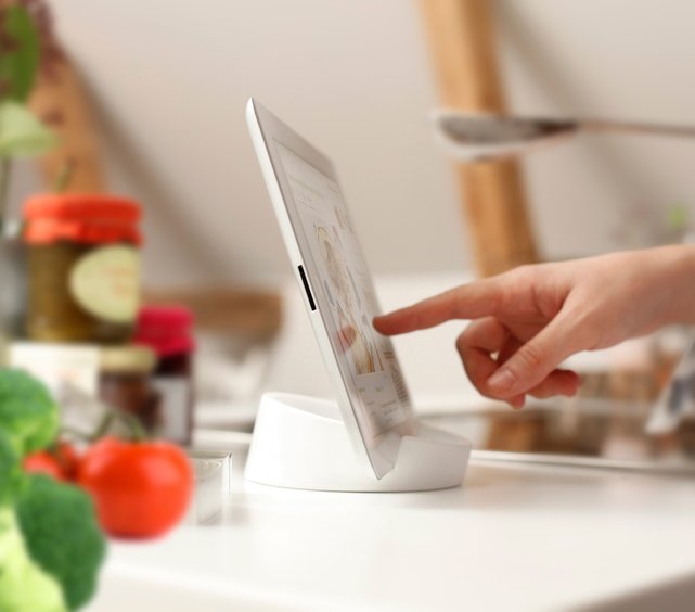
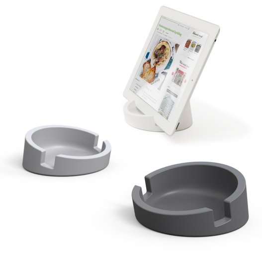
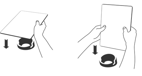
Tablet stand
For Bosign
Industrial design
User research
CMF

The Kitchen Tablet Stand for home chefs is a simple and versatile iPad or tablet platform for the home. Designed and developed to fit the kitchen environment and cater for the needs of today’s cooks who search online for recipes, follow instruction videos and listen to music while cooking.
To comply with food safety regulations, the Tablet Stand is made from food grade silicone. As well as being durable and long lasting, the product is especially easy to recycle. The development process included finding the correct material flexibility to achieve a stable and sturdy form that also acts as a non-slip surface and protects the tablet surfaces.
The Kitchen Tablet Stand was awarded ‘Kitchen Innovation of the Year’ at the world’s leading
consumer goods fair, Ambiente in Frankfurt. Loved by the Kitchen Innovation consumer panel as well as the expert jury for the best product Design, Innovation, Ecology and Material quality.
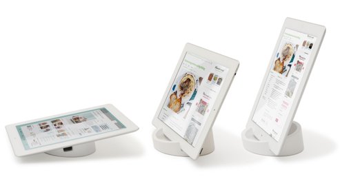
The form enables steady usability of the tablet
in the standing position or lying down.
In all positions, the Tablet stand’s soft and non-slip surface
ensures it will rest securely without sliding off.
The form was carefully refined through many iterations of 3D modelling to ensure reliable results for the user.
This form was eventually applied on a variety of materials to fit different styles of home environments and price ranges.

Concrete
Stone
Silicone
Porcelain
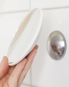
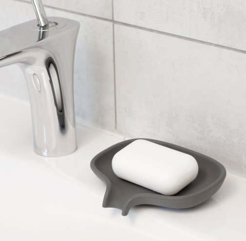
Flow
Self draining soap dish
Industrial design
Packaging design
CMF
A smart solution for soggy soap. The unique form drains the excess water from the dish to the sink keeping the soap dry after use.
This product was very popular and sold over 300,000 units around the world, perhaps thanks to its simple sculptural form that tells the story of its function.
Johan & Nyström
Café and store interior design
Concept development
Interior design
Architectural drawings
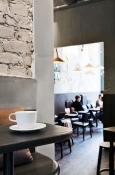
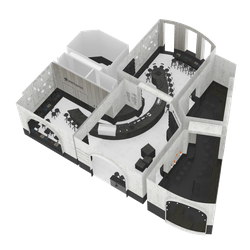
A unique interior design delivered to the coffee roastery and café company Johan och Nyström.
The simple design preserves the special qualities of the location and highlights the quality of the product and service.
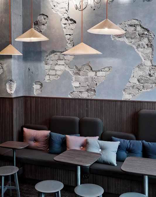
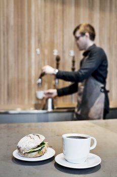
The project consisted of an original material, furniture, lighting and accessories profile applied on an accurate 3D model and detailed drawings.
Many elements of ergonomics and functionality had to be considered in the bar planning and the seating areas.
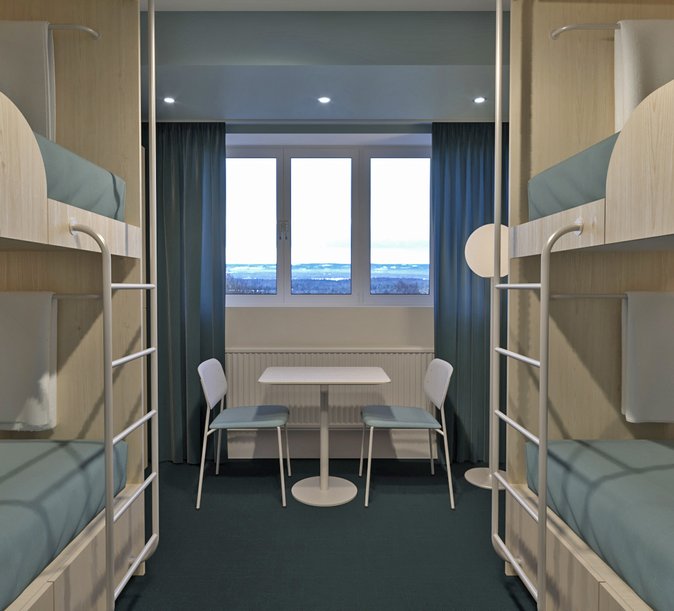
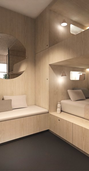
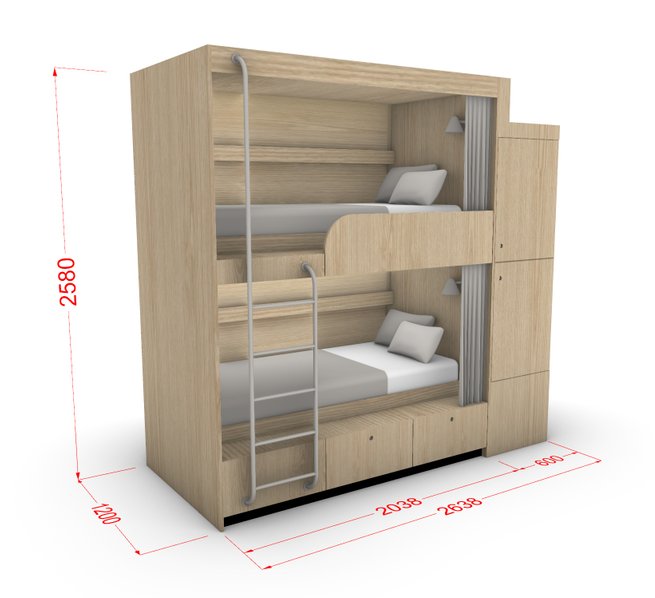
Frösö park
Capsule hotel
Concept and branding
Industrial design
Interior design
A concept and detailed design for a hotel in Östersund – based on a new branding profile.
Custom made Bunk-bed units were developed to be placed in different sized rooms. The project included planning the production in different pieces that can be shipped efficiently and mounted on site.
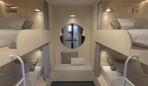
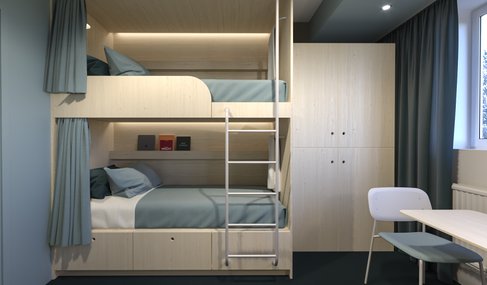
The project consisted of an original material, furniture, lighting and accessories profile applied on an accurate 3D model and detailed drawings.
Many elements of ergonomics and functionality had to be considered in the bar planning and the seating areas.
Vessel
Pendant lamp
Industrial design
Technical drawings

Wall and ceiling lighting for the premium Italian brand Nemo Lighting.
The minimal forms are meant to evoke a strong visual experience and at the same time a sense of balance and tranquility.
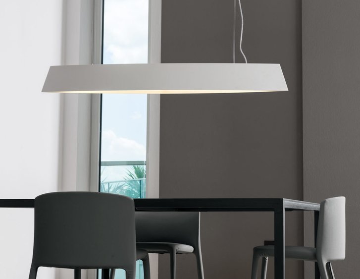
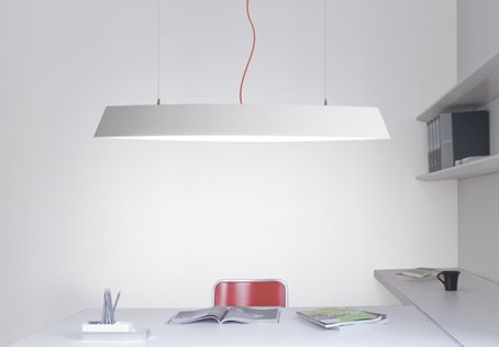
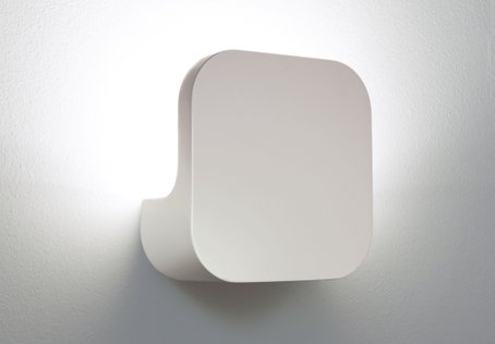
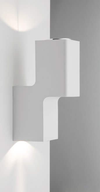
The lighting fixures are produced in Aluminum and ceramic material and are available in a range of finishes I selected with the manufacturers.